Itinari
I designed Itinari, a mobile travel itinerary app, to make trip planning simpler, more collaborative, and more personalized. This project allowed me to combine my love for travel with my UX/UI design skills, resulting in a clean, intuitive tool to help users plan their trips without the usual stress or scattered notes.
In today’s fast-paced world, planning a trip can quickly become overwhelming. Between juggling tabs, group chats, and booking platforms, travellers are often left piecing things together across multiple tools. With Itinari, my goal was to streamline the planning experience and make it easy (and even enjoyable) to build, edit, and share travel plans in one place.
As the sole designer on this project, I was responsible for the entire design process, from initial research and concept development to prototyping and user testing. This hands-on involvement allowed me to ensure a cohesive and user-centered design throughout the app.
The Scenario
Itinari was inspired by my own travel experiences and countless chats with friends who shared the same frustrations. Whether it was last-minute Google Docs, missing Airbnb addresses, or five different apps to keep track of everything, there was a gap. Many existing solutions lacked integration, forcing users to juggle multiple apps and platforms. By consolidating essential features into one intuitive interface, I aimed to alleviate these frustrations and create a more seamless travel planning experience.
Define the Objectives
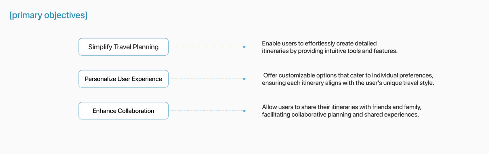
To guide the development of the app, I established clear objectives that focused on addressing key user needs and enhancing the overall travel planning experience.
Goals
To guide the design, I focused on three main objectives:
1. Simplify planning
Help users create and manage itineraries effortlessly, with a clear and intuitive interface.
2. Enable collaboration
Make it easy to share trips with friends and plan together in real time, whether you’re across the room or the world.
3. Offer personalization
Allow users to tailor itineraries to their travel style, from solo adventurers to budget-conscious students to digital nomads.
To assess the app’s effectiveness, I would establish key success metrics, such as itinerary completion rates, user engagement, and feedback on usability, to guide future improvements and validate design decisions.
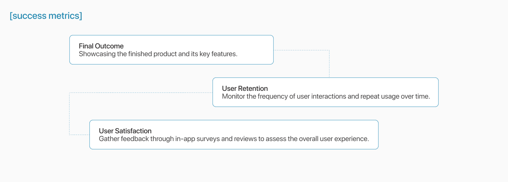
To measure success, I defined key metrics like itinerary completion rates, sharing frequency, repeat usage, and overall user satisfaction. These would serve as benchmarks for future iterations.
Research Goals and Methods
Understanding User Needs
To understand traveler behaviors and frustrations, I interviewed six frequent travelers and sent out a short survey. I wanted to learn how people currently plan their trips, what tools they rely on, and what features they actually find useful. Even though this was a personal project, I approached it with the same mindset as a real-world challenge, focusing on empathy, user needs, and practical insights to guide my design decisions.
• How do people currently plan trips?
• What tools do they use (and dislike)?
• Where do they feel friction, and what features would genuinely help?
Insights & Pain Points
My research revealed several consistent pain points that guided the design of Itinari. Travelers often felt overwhelmed by the sheer amount of information and found themselves juggling too many tools like Google Docs, booking apps, calendar links, all in different places. This fragmented experience made planning stressful, especially for groups. Users also expressed frustration with the lack of flexibility and mobile accessibility when plans inevitably changed on the go. Overall, they were looking for a simpler, more integrated way to plan, personalize, and collaborate on their trips.
Gathering Feedback
To validate my assumptions and inform the design process, I planned to gather feedback from users on both existing travel planning solutions and early design concepts for the new app. This approach helped identify gaps in functionality while ensuring the final product aligned with user expectations.
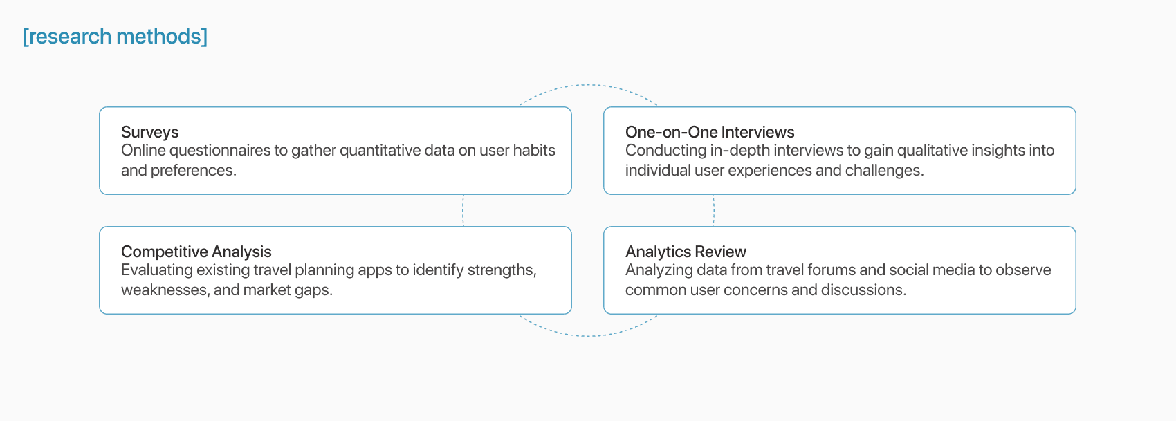
Research Methods
I would employ a mix of qualitative and quantitative research methods to gain well-rounded insights:
Overall Findings
The research uncovered several key insights that shaped the direction of the app:
Overwhelming Information: Users are often overwhelmed by the sheer volume of information, making it hard to prioritize and stay organized.
Fragmented Planning Tools: Many travelers resort to using multiple apps, leading to a disjointed and inefficient planning experience.
Desire for Flexibility: Users expressed a strong preference for customizable itineraries that align with their unique interests and schedules.
Collaboration Challenges: Coordinating plans with travel companions emerged as a common pain point, with users seeking seamless sharing and collaborative features.
Define the Problem
Drawing from the research insights, a clear problem emerged:
Many travellers, especially those planning group or multi-stop trips, struggle with disjointed tools and an overwhelming amount of information. There’s a lack of centralized, mobile-friendly platforms that allow users to plan, personalize, and collaborate seamlessly.
Define the Audience
Identifying Target Users
Itinari is designed for all travellers who rely on their phones to stay organized on the go. That includes:
• Young professionals planning quick weekend getaways or work trips
• Students looking for affordable and flexible travel tools
• Digital nomads juggling remote work while hopping cities
Research revealed that a significant portion of travellers use mobile apps to plan and book their trips. In 2023 alone, over 850 million people used travel apps to manage their travel plans, and 61% of U.S. travellers relied on smartphones to book and pay for travel arrangements. These users seek a seamless, efficient, and personalized planning experience that caters to their dynamic lifestyles and unique travel goals.
Creating Personas
To better represent my audience, I created two personas:
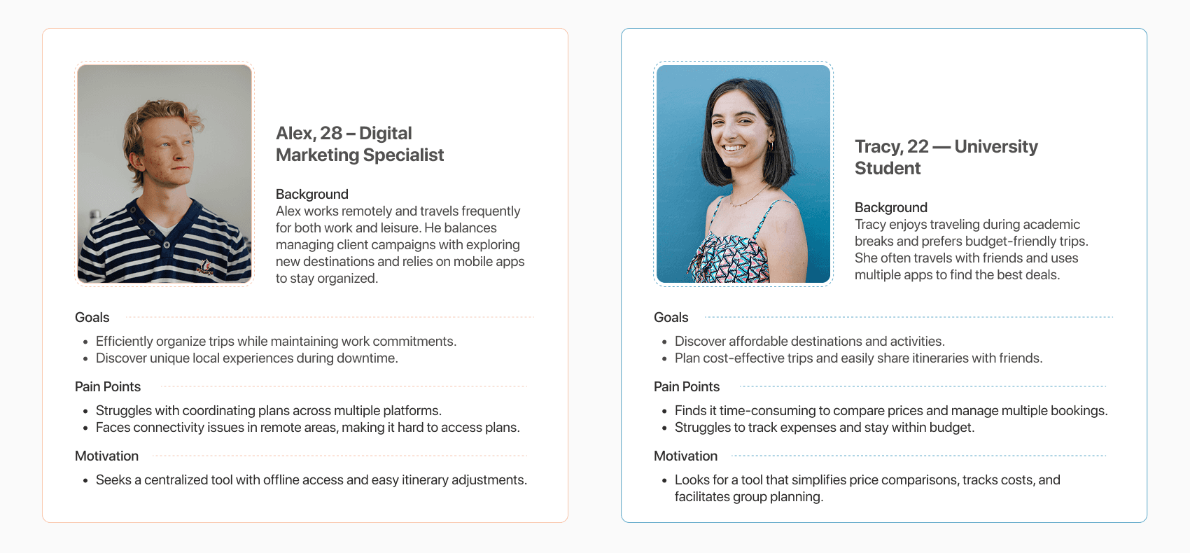
Alex, 28 – Digital Marketing Specialist
Alex works remotely and travels frequently for both work and leisure. He values efficiency and seeks to organize trips that balance work commitments with exploration. However, he often struggles with coordinating plans across multiple platforms and ensuring reliable internet access during his travels.
Tracy, 22 – University Student
Tracy enjoys budget-friendly travel during academic breaks, often seeking affordable destinations and activities. Her primary goal is to discover cost-effective options while managing bookings within a student budget. However, she finds it time-consuming to compare prices and juggle multiple platforms to finalize her plans.
Ideation & Core Features
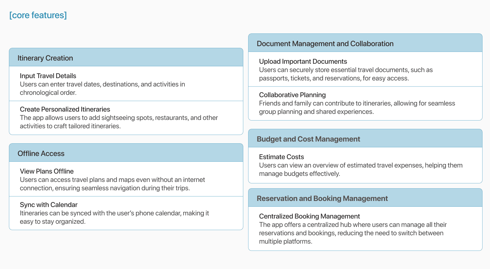
After mapping out pain points and goals, I brainstormed features that would directly address user needs. I sketched, scribbled, and mind-mapped my way through early concepts before locking in a few core features:
Core Features
The brainstorming process led to the identification of several key features that would enhance the app’s functionality and user experience:
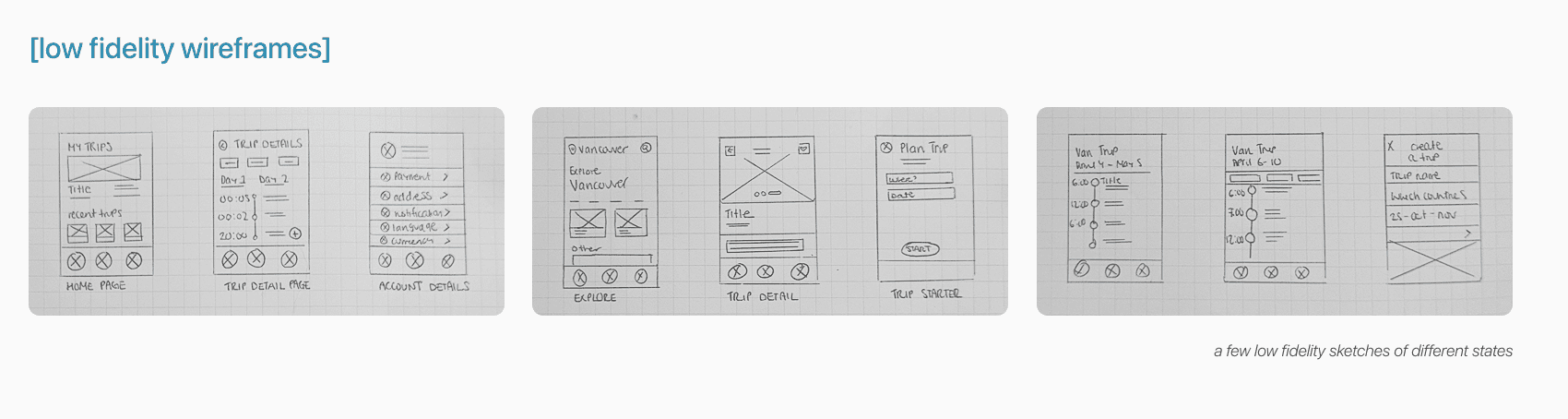
The Design Process
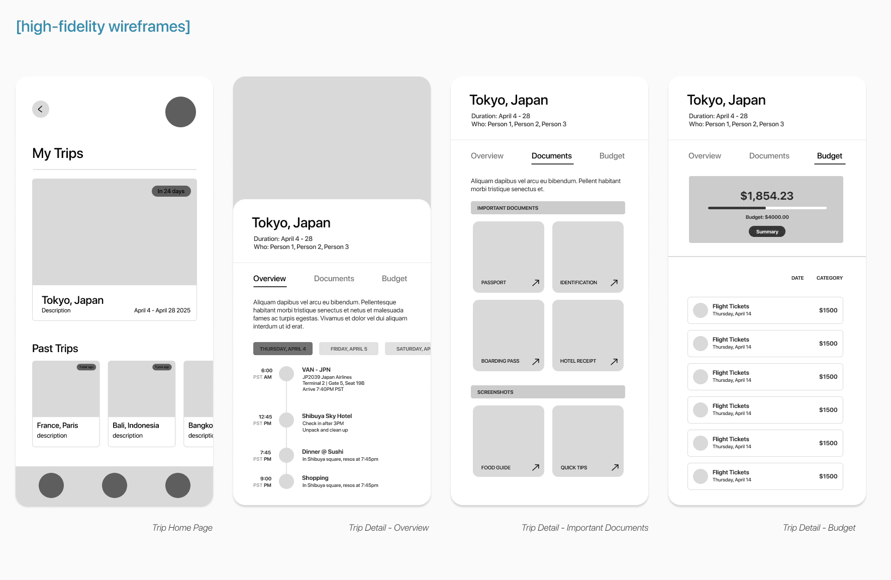
I began with low-fidelity wireframes to map out the app’s core structure and user flows, like creating a trip, adding activities, and inviting friends. These early sketches helped me explore different layouts and refine the experience before moving into visual design.
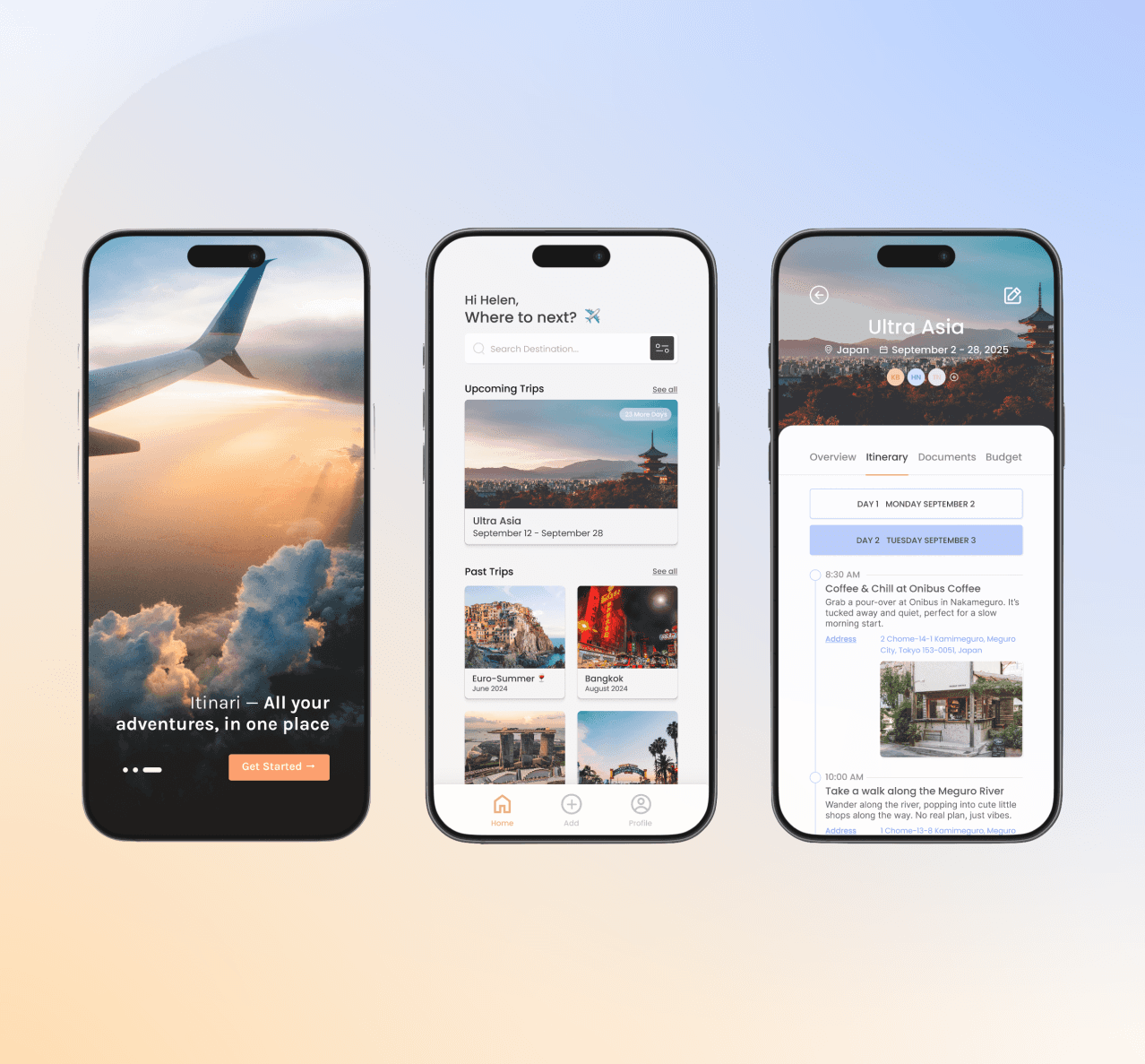
As I moved into high-fidelity prototypes, I focused on bringing the experience to life through clean visuals and thoughtful interactions. My goal was to create something that felt intuitive and polished, an app users could navigate with ease. With each round of feedback, I refined the details to keep the experience simple, clear, and genuinely useful.
Provide The Solution
The final design delivers an intuitive, user-centered solution that simplifies travel planning.
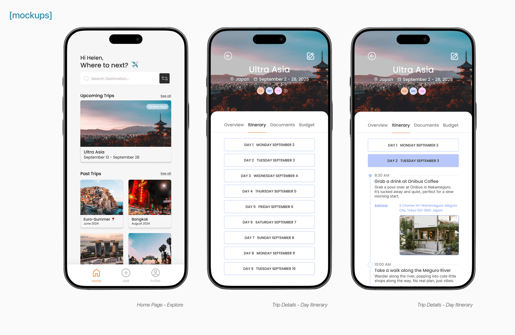
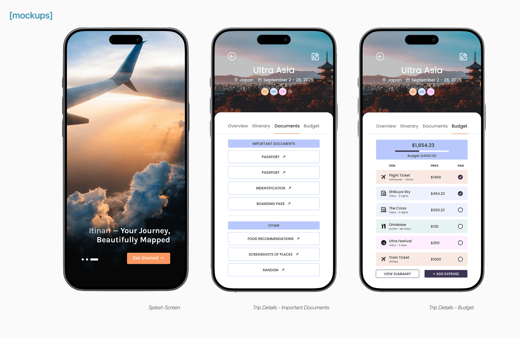
Create and Customize Itineraries
Users can effortlessly build detailed itineraries by adding activities, adjusting schedules, and tailoring plans to suit their preferences. The interface is designed to accommodate flexibility, allowing users to make changes with ease.
Collaborate with Others
The app facilitates seamless collaboration by enabling users to share itineraries with travel companions. This feature promotes group involvement, ensuring that everyone stays informed and engaged throughout the planning process.
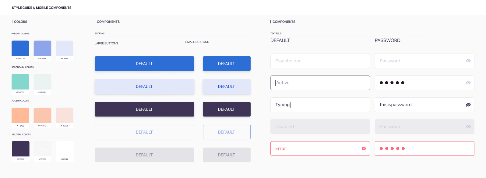
The colour palette and typography were thoughtfully chosen to support clarity and ease of use. The visual design strikes a balance between simplicity and functionality, making the interface straightforward to navigate.
Testing & Iteration
I tested the prototype with 5 users (from my initial research group) through quick Zoom sessions and screen recordings. I asked them to walk through tasks like creating a new itinerary, adding an activity, and sharing the trip with a friend.
Key Findings
Feedback highlighted the need for more robust offline capabilities, as users expressed a desire to access their itineraries without relying on internet connectivity. Additionally, some participants found the navigation cues unclear, which led to confusion when moving between different sections of the app.
Iterations and Improvements
Based on these insights, I refined the design to address these concerns. Offline access was implemented to ensure users could view their plans anytime, even in areas with limited connectivity. I also enhanced the navigation menu by introducing clearer visual cues and improving overall accessibility, resulting in a more intuitive and user-friendly interface.
Conclusion & Final Thoughts
This project was a reminder of how valuable a user-centered approach is when designing practical solutions. By taking the time to understand real needs and iterating along the way, I was able to create a travel planning app that feels simple, personal, and easy to use, especially for those planning with others.
Itinari balances function and clarity, helping users stay organized without the usual stress. This process reinforced my belief that meaningful design emerges when user insights drive decision-making at every stage.